Overview
My own college's website felt like it was working against the students it was meant to serve — so I rebuilt it as a self-initiated project to prove what a modern, student-friendly version could look like.
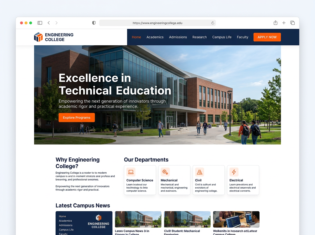
The Challenge
The original site had outdated information architecture, inconsistent visual design, and wasn't optimised for the mobile devices most students actually use to check timetables and notices.
Approach
- Mapped out the information students and prospective applicants actually search for, and restructured navigation around it.
- Built a fresh, modern visual design system consistent across every page.
- Prioritised mobile performance, since most current students check the site from their phones between classes.
The Solution
A ground-up redesign of the college website with a cleaner information architecture, consistent modern styling, and a mobile-first build.
Outcome
The project became one of my strongest portfolio pieces and a talking point in later client conversations — proof I could take on an entire institutional site independently.